How to Choose Colors That POP on Print on Demand Products (RGB vs. CMYK Explained)

When it comes to print on demand color is everything. The right shades don't just make your products look sharp they grab attention and get more buyers to hit that add to cart button.
Strong color choices can turn a simple design into something people remember building your brand and boosting sales at the same time.
But here's the kicker: printing color isn’t as simple as it looks on your screen. RGB and CMYK work differently and if you ignore this your products might not pop like you expect.
In this post you’ll get clear tips for picking colors that really stand out on POD products plus straight talk on the real impact color has on branding and buyer behavior.
Ready to skip the print disasters and make colors that sell? You’re in the right place.
Stick around for the essentials on RGB vs CMYK smart color strategies and the most common POD order problems you can avoid with the right color choices.
Understanding Color Modes: RGB vs. CMYK
Choosing the right color mode sounds like a small detail but for print on demand success it’s a big deal. Your design might look crisp and electric on your laptop but there’s a catch screens and printers speak different color languages.
Before you upload that masterpiece you need to know when to use RGB and when to switch to CMYK.
Otherwise you risk colors that fall flat or print surprises that disappoint your customers (and eat into your profits).
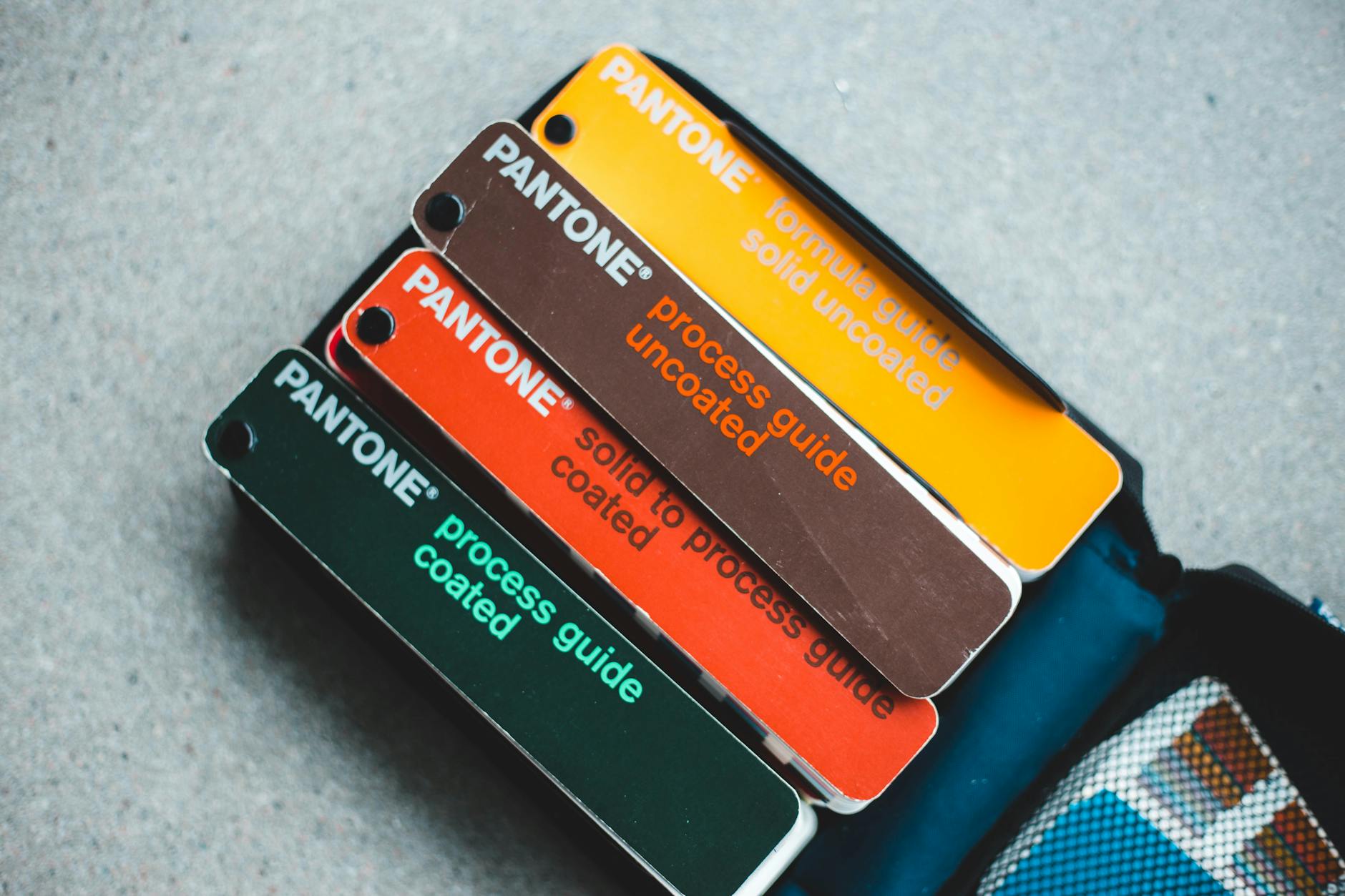 Photo by Erik Mclean
Let’s break down what makes RGB and CMYK tick and where each is the right fit for your designs.
What is RGB and When Should You Use It?
RGB stands for Red, Green and Blue. Think of it as the pixel party that happens inside every phone, laptop or monitor. Screens use these three colored lights and mix them at different intensities.
That’s why when you’re designing your next best selling t-shirt or mug mockup the colors are bold and sometimes almost glowing.
Key things to know about RGB:
- It’s the standard for anything digital like websites, social media, mockup previews and digital ads.
- Mixing all three colors at full power gives you white; turning them all off gives you black.
- This additive method lets you display millions of color possibilities on any modern screen.
So when should you use RGB for your print on demand projects?
- Designing product mockups: When you’re sharing images on your shop or creating digital ads, RGB is your go to mode.
- Previewing colors for online customers: What buyers see in your store is almost always an RGB image built for screens.
- Anytime you’re working with graphics that never leave the digital world: Social content, email graphics and video thumbnails all live happily in RGB.
Just keep in mind what looks awesome in RGB can go dull when sent to a printer because printers use ink not light. That’s why understanding CMYK is so important.
Want a deeper dive? Check out this simple comparison of RGB vs CMYK color modes for more on how each system mixes and creates color.
What is CMYK and Why is it Essential for Printing?
CMYK stands for Cyan, Magenta, Yellow and Key (Black). Instead of using light CMYK uses physical ink to bring images to life.
This model is subtractive every layer of ink absorbs (subtracts) light making the printed result slightly darker with each color added.
Why does this matter for print on demand?
- Printers can’t reproduce the electric colors you see on a screen. That neon green or super-bright orange is often outside a printer’s range so files in RGB are automatically converted to CMYK during the print process sometimes with underwhelming results.
- CMYK ensures accuracy and consistency. By starting in CMYK (or at least converting before uploading) you know exactly how your blues, reds and other shades will look on the finished shirt or art print.
- No more print surprises. Designs left in RGB risk printing as washed-out, muddy or just plain off. Sticking to CMYK from the start gives you more control.
The science is simple:
- Mixing all CMY inks together creates a muddy brown, not black. That’s why printers add dedicated black (K) ink for deep shadows and clear contrast.
- CMYK blending works through layers: each pass adds density, physically building your image from light to dark.
Here’s what this means for anyone running a print on demand business:
- Convert your artwork to CMYK before sending to print. Your reds will stay vibrant your blues won’t turn purple and your samples match what you preview.
- Double check how different printers handle color. Each provider may have a slightly different color gamut (the range of printable colors).
- Some color shifts are unavoidable but planning ahead saves time, money and headaches.
Shop owners can check out this in-depth color matching guide for print on demand products for more tips on prepping files and avoiding color mishaps.
If you’re looking for the science behind on demand prints and how color accuracy gets managed Pantone has a helpful breakdown of facts about on demand prints.
Making sense of RGB vs CMYK sets you up for fewer returns, happier buyers and a brand that truly pops in every print run.
How to Choose Vibrant, Eye-Catching Colors for POD Products
With print on demand color is your loudest voice on the shelf. Your choice of hues can make a shirt jump off the page or cause a tote bag to blend into the background.
Creating products that get those quick scroll stops and double-takes starts with understanding color’s power and how it actually looks once printed.
Let's steer clear of dull and get straight to what works for mood, materials, and selling more.
Color Psychology: Picking Hues That Resonate
Colors aren’t just for style they tell stories and drive emotion. Shoppers react almost instantly to color which means your palette isn’t just an art choice; it’s a business move.
In the noisy world of print on demand tapping into color psychology can put your designs ahead.

Photo by Codioful (formerly Gradienta)
Start with the basics:
- Red grabs attention and sparks excitement great for bold, energetic or urgent themes.
- Blue feels trustworthy and calming. Perfect for brands focusing on reliability or wellness.
- Yellow signals cheerfulness and optimism. It’s bright, lively and a top pick for youth focused designs.
- Green brings nature and calm often linked to eco-friendliness and health.
- Black gives a premium edge and works for sleek, minimalist products.
- Pink often reads playful and creative especially for lifestyle and fashion niches.
Pick colors that speak to your target customer. If your niche is fitness? Go bold and energetic. Skinny jeans and indie art? Think moody or pastel.
A few quick tips:
- Use contrasting colors to direct a shopper’s eye (think bold text over soft backgrounds).
- Avoid muddy mixes or too many competing tones in one design.
- Keep brand identity front and center. Repeat signature colors to build recognition.
If you want a deeper look at color’s impact check out The Psychology of Color in Print on Demand and get clear on why 75% of first impressions are decided by color alone.
For building trust discover how color influences response rates and branding success in Color Psychology for Your Clothing Brand.
Here’s the simple truth: Clean, balanced and strategic use of color can upgrade a standard tee to a bestseller.
You’ll also want to think about color trends what’s popping on social lately? What do your top competitors use? Research but don’t copy. Make your own palette stand out.
Want more POD marketing tips? Find evergreen advice in Print on Demand Marketing Tips.
Matching Your Colors to Print Methods and Materials
Not all colors print the way you imagine. Your design might be electric on your laptop but different printers, inks and even fabric types can change those colors sometimes a little sometimes a lot.
Color on a thick canvas tote? Could look faded compared to a white polyester tee. Even switching between glossy mugs and matte notebooks can tweak shade and vibrance.
Here’s how to make sure your colors pop:
- Get to know your material. Each fabric or product has a unique base tone. Test a swatch on the exact item (not just a plain white test print).
- Always review a color chart or swatch book from your POD supplier don’t just guess from a screen.
- Order samples. There’s no substitute for holding the real thing. Use these to fix colors that looked off once printed.
- Stay within the printable color range (gamut). Mega bright RGB colors sometimes can’t be matched in CMYK ink especially for neon and soft pastels.
- Convert designs to CMYK before uploading. Preview the changes and tweak colors for the most accurate print.
Quick checklist for real world color match:
- Compare your design file (in CMYK) side by side with a sample print.
- Test the same color across different products if you’re expanding your line.
- Adjust for different finishes—matte absorbs more light, gloss reflects (often making colors appear bolder).
If you’re still unsure about translating digital color to real world print, check out this solid Color Matching Guide for Print on Demand Products.
For the deep dive especially if you’re juggling Pantone colors or have a picky brand palette look at A Designer’s Guide to Color Matching in a Graphic Overlay.
Keep in mind: Clean simple contrasts often work best. Avoid overcrowding your design with too many shades let your main message shine.
Take the time to sample and test and your POD products will stand out in any crowd.
Avoiding Common Color Pitfalls in Print on Demand
Color can make or break your print on demand products, but even the boldest design can fall flat if you trip over the classic color pitfalls.
From head scratching color shifts to prints that look nothing like your mockups these issues are more common than you think.
Here’s how to keep your colors accurate so your products always pop and your customers keep coming back.
Previewing and Proofing: Your Safety Net

Photo by Cherylanne Hsieh
Let’s be honest what you see on your laptop isn’t always what you get in your mailbox.
To sidestep disappointment here’s your quick toolkit for previewing and proofing your designs before they go live:
- Preview in the right color mode. Always check your final design files in CMYK not just RGB. Lots of graphic programs let you soft proof how colors will look in print and this step alone saves tons of grief later.
- Create test prints on actual products. Don’t just rely on digital previews or flat swatches. Order sample prints on the real items you sell—shirts, mugs, canvases. A test run exposes hidden issues like faded reds or blues that look purple.
- Request physical proofs not just digital ones. Many print on demand vendors offer physical proofs. This way you can catch details like banding, color bleeding or spots where the design gets cut off at the seam.
- Check your reviews and listen to customer feedback. Sometimes the first sign of a color problem comes from a buyer. Stay ahead of the curve by handling complaints fast and tweaking your designs.
Here’s a pro tip: Build a consistent workflow for quality control. Use a checklist to review every file you upload to avoid simple mistakes like putting design elements too close to the edge or skipping bleed zones.
Quality control isn’t about being picky it’s about guaranteeing your designs always shine.
Want more structure for your review process? The printing quality control checklist from Gelato is packed with actionable steps that keep color accuracy and alignment looking sharp.
If you work with more than one POD vendor compare their proofs side by side. Some printers handle bold colors better while others might nail softer pastels.
Consistency between batches means fewer surprises which translates to happy customers and better reviews.
From experience taking time to proof saves serious hassle (and expense!) over dealing with misprints or product returns.
Handling Color Shifts and Printing Mistakes
It stings when you open a freshly printed order and the colors look faded or “off.” Truth is even the best printer can twist your colors if you’re not careful.
Here’s why these shifts happen and what you can do to fix them:
- Ink and substrate matter. Inks interact differently depending on the product material. Printing on a dark cotton shirt? Expect colors to look less vibrant than on a white mug or poster. Synthetic fabrics like polyester soak up color in their own unique way too.
- Batch differences happen. Not every print run will look identical. Heat, humidity and even ink batch changes can all affect color consistency. Stay alert: a sky blue on your June sample may look a bit green come December.
- Design in printable color ranges. That neon pink or glowing turquoise you built in RGB? It probably won’t print as expected. Stick to colors within the standard CMYK gamut for the most reliable results.
If you come across a color fail try these troubleshooting steps:
- Compare the design file against the print. If the print is off double check your original file in CMYK. Sometimes files sneak through with RGB artifacts that don’t convert cleanly.
- Check your vendor’s setup. Different shops use different machines. Ask for their recommended color profiles and make sure you’re exporting your files with those settings.
- Keep batch samples for reference. Store one product from each batch you print. These samples help you spot long term trends in color quality or catch issues if a customer says their order looks different from your shop photos.
To reduce future headaches standardize your file exports, request batch proofs on a regular cycle and never assume the default settings are best for every design.
Dull prints, washed out artwork or off-center colors are among the most common headaches in this business. If you want a user driven perspective the discussion on troubleshooting faded and dull POD prints is a gold mine of real world tips.
And if you want to avoid the rookie mistakes that cause the most pain (think design cutoffs or muddy color blocks), check this breakdown of common print on demand mistakes and their solutions.
Even seasoned sellers get tripped up by color shifts so audit your shop for problem orders regularly. If you ever run into major color or print issues don’t sweat it happens to everyone.
For more advice see our guide to Print on Demand Order Problems and stay one step ahead of the curve.
Taking the time to preview, proof and troubleshoot gives you the control you need to deliver POD products that stand out and keep customers coming back for more.
Conclusion
Choosing the right colors and understanding the difference between RGB and CMYK sets your print on demand products apart. Using the right color mode for each step helps your designs hold up on screen and in print so what your customer sees is what they get.
Stick to key steps: design in RGB for screens switch to CMYK before sending to print, proof with real samples and adjust based on material and finish.
Great products start with confident choices. Trust the process, test your colors and don’t be afraid to try bold options that speak to your brand.
The best print on demand entrepreneurs experiment and tweak until their products stand out on the shelf. If you want to expand your reach with strong visuals check out helpful tips in Print on Demand Social Media Strategies.
Thanks for reading your next bestseller might just be a color tweak away. Which colors will you try first? Share your ideas or tips in the comments and help the community grow.


0 Comments