Color Management for Print on Demand: How to Make Your Design Colors Match Printed Results Every Time

Getting your design colors to match printed output is one of the toughest challenges in the print on demand business. Without proper color management, what looks perfect on screen can turn out dull, off, or just plain wrong on your final product.
This not only dents customer satisfaction but also hurts your brand’s reputation and consistency.
Color management isn’t just a nice-to-have—it’s essential for keeping your prints reliable and your customers happy. In this post, you’ll learn how to tackle common color mismatches and make sure your designs come out looking exactly as intended every time.
For troubleshooting tips on print issues beyond colors, check out this Print on Demand Order Issues Guide.
Understanding Color Management Basics
When working in print on demand, knowing how colors behave across different devices is a game-changer.
The colors you see glowing on your screen aren’t exactly the colors that pop off a printed shirt or poster.
This is why understanding the basics of color management is essential—it’s the bridge between what you design and what your customers receive.
Let’s break down the key pieces you need to know.
Color Spaces and Profiles
Colors in design aren’t just colors—they belong to specific color spaces.
The two main players you'll hear about are RGB and CMYK, and each plays a distinct role in how colors are displayed and printed.
- RGB (Red, Green, Blue): This is the color space used on screens like your computer monitor, phone, or tablet. RGB is an additive color model, meaning colors get brighter as light mixes together. It’s perfect for anything digital but doesn’t quite translate to print.
- CMYK (Cyan, Magenta, Yellow, Black): This color space is designed for print. Unlike RGB, CMYK is subtractive—colors appear by absorbing light rather than emitting it. Printers combine ink in these four colors to reproduce your design on physical materials.
Why does this matter? Because when you design in RGB and jump straight to print, colors can shift wildly.
Bright neon blues might dull, reds may appear muddy, and vibrant greens could lose their punch. That’s where ICC profiles come into play.
ICC profiles act like translators between your screen and printer. They’re standardized color profiles created to keep colors consistent no matter which device you use.
By embedding these profiles in your design files, computers and printers understand exactly how to interpret and reproduce each color correctly.
Think of ICC profiles as the secret language that stops your print from turning into a guessing game.
For a detailed guide on how to handle color profiles in print-on-demand workflows, you might want to check out this Beginner's Guide To Colour Profiles.
Calibration and Its Role in Accurate Color
Even with the right color space and profiles, your colors can still go off course without proper calibration.
Calibration means adjusting your gear so what you see on screen matches what gets printed.
Here’s why it’s a must:
- Monitors: Not all screens display colors the same way. Without calibration, one monitor might show a design as bright and vivid, while another looks washed out. Calibration tools (like colorimeters) adjust your monitor’s settings—brightness, contrast, gamma—so colors are more true to life.
- Printers: Printers can drift over time. Ink density, paper quality, and environmental factors all affect color output. Calibrating your printer involves printing test charts and tweaking settings until the printed colors line up closely with your digital files.
Calibration isn't a one-time setup—it’s a regular routine to keep things consistent. Think of it as tuning an instrument before a show. Without it, the performance (or in this case, your prints) could fall flat.
If you're running a print on demand business and want to nail color accuracy, learning how to calibrate your tools is non-negotiable.
For practical steps and the equipment you’ll need, this How to Color Calibrate Your Monitor to Your Printer article breaks it down well.

Photo by Darina Belonogova
Both color spaces and calibration are like the foundation and tuning of a car before a big race—you don’t just want to show up, you want to finish strong.
Proper color management systems help your print on demand products stay true to your original vision, building trust with your customers every time.
For more insights on common color issues in print on demand and how to solve them, visit this Print on Demand Order Issues Guide.
Common Color Challenges in Print on Demand
When working with print on demand, matching your design colors perfectly on the final product often feels like chasing a moving target.
Several factors outside your design software influence how colors appear when printed.
Two major culprits behind color inconsistencies are the material you choose and the printing technology used.
Understanding these can save you lots of headaches and improve your quality control process significantly.
Material and Substrate Impact on Color
Materials aren't just the surfaces you print on; they actively influence how colors look.
Think of fabric types like cotton and polyester as different kinds of sponges, each soaking up ink and dye in their unique ways.
This difference directly affects color intensity, vibrance, and even tone.
- Cotton: This natural fiber absorbs ink deeply, resulting in colors that appear soft and muted. For example, white cotton tends to make colors look more matte and subdued compared to synthetics.
- Polyester: Polyester has a smoother surface and less absorbency. When printing on polyester, colors often look sharper, glossier, and more vibrant—especially with processes like sublimation printing where the ink dyes the fabric rather than sitting on top.
Even within these broad categories, finish and weave matter. A rougher texture scatters light differently, making colors appear duller.
Conversely, smooth or tightly woven fabrics reflect light uniformly, preserving color brightness.
Dark-colored fabrics pose extra challenges since the base color can distort or dull your design colors unless pre-treatment or special printing techniques are used.
Environmental factors such as moisture and temperature during printing and drying can also impact color outcomes on different materials.
This makes it crucial to test prints on the exact fabric you plan to sell.
For a detailed look at how different fabrics affect print colors and tips on managing these challenges, check out this excellent guide on how fabric colors alter print results.

Photo by Cherylanne Hsieh
Printer Technology Differences and Color Consistency
Not all printers are created equal—this is especially true when it comes to color accuracy and consistency in the print on demand world.
The printing method you choose has a huge effect on how closely your final product matches your original design.
Let’s look at some common technologies and their impact on print colors:
- Digital (DTG - Direct to Garment): Digital printing sprays ink directly onto fabric. It works great for complex designs with lots of colors and short runs. However, colors can sometimes appear less saturated, especially on darker fabrics, due to ink absorption and fabric texture.
- Screen Printing: Ideal for large batches with fewer colors. Screen printing deposits a thicker layer of ink, leading to more vibrant colors and better opacity. However, it’s less flexible for color gradients or intricate details.
- Sublimation: This uses heat to transfer dye into polyester fabrics. The colors are vibrant and long-lasting but limited to polyester or poly-blends. Sublimation can’t print on cotton, so colors and fabric choice are tightly linked.
- DTF (Direct to Film): A newer method that prints on film before transferring to fabric, blending the versatility of screen and digital prints. DTF often yields more consistent color saturation across different fabric types.
Each technology uses inks with different properties that affect color transparency and durability. For example, ink transparency varies so the same color may look richer or duller depending on the printer.
This variability makes it crucial to work closely with your print provider or test samples extensively.
Environmental factors during printing—like humidity or print speed—can also shift color results subtly. That’s why quality control includes constant calibration and communication with your manufacturer.
For an in-depth breakdown on managing color consistency across print technologies, this Color Matching Guide for Print-on-Demand Products offers solid, practical insight.
By understanding how materials and printing technologies each affect color, you gain solid control over your print on demand products’ final look.
This leads to happier customers and fewer returns due to color disappointment. Think of it as knowing your paintbrush and canvas before you start painting—every detail counts.
For more help on common print issues beyond color and in-depth troubleshooting, explore the extensive Print on Demand Order Issues Guide.
Techniques and Tools to Ensure Color Accuracy
When working with print on demand, it’s easy to underestimate how much effort goes into making sure your design colors come out perfectly in print.
It’s not just about crafting a beautiful digital design, but also about preventing those frustrating surprises when the printed product doesn’t match what you envisioned.
That’s where a few key techniques and tools come into play—acting as your color guardians from screen to product.
These methods help you catch errors early and maintain consistent results, saving you time and money.
Soft Proofing and Hard Proofing
Think of soft proofing and hard proofing as your color rehearsal before the big print. They give you chances to preview and adjust your designs so the final prints look just right.
Soft Proofing is the digital equivalent of a dress rehearsal. It uses on-screen simulations, often based on ICC profiles, to show how your design colors will appear once printed.
This process helps identify potential color shifts caused by printer limitations or paper types without wasting ink or materials.
Many design applications like Adobe Photoshop and Illustrator offer soft proofing features that enable you to toggle different printer profiles.
Advantages of soft proofing include:
- Quick previews without printing costs
- Ability to catch color mismatches early
- Easy to experiment with color adjustments
However, keep in mind that soft proofing depends on your monitor being properly calibrated. If your screen isn’t showing accurate colors, the soft proof won’t help much.
Hard Proofing, on the other hand, is a physical print. It’s like the final dress rehearsal where you hold the actual print in your hands and see the colors, textures, and details firsthand.
Hard proofs are essential for high-stakes projects or when exact color fidelity is critical, as they reveal how inks and materials interact under different lighting.
Benefits of hard proofing:
- Real-world color and finish preview
- Detects problems invisible on screen
- Builds confidence before mass production
Hard proofs usually cost more and take longer but provide a safety net that’s hard to beat.
Sometimes print on demand services offer options for both proof types, letting you combine the best of fast digital checks and tangible results.
For a solid explanation of proofing with practical tips, this article on Printing Proofs: Soft Proofs vs Hard Proofs is a great resource.
Using Color Management Software and Plugins
To keep your colors consistent across platforms and printers, using dedicated color management software is a powerful step.
These tools not only help calibrate colors but also allow you to fine-tune profiles that work specifically for your print on demand setups.
Here are some popular software solutions designed to help you take control of your print colors:
- ColorPath Color Management Software: This cloud-based platform simplifies color calibration for novices and pros. ColorPath syncs your devices and provides easy tools to create and maintain color profiles that ensure predictable printing results. It’s particularly useful if you’re handling varied print materials or multiple printers. Learn more about its features here.
- Fiery Color Profiler Suite: A robust option for serious print quality control. Fiery’s suite integrates color management and profiling tools, letting you manage color consistency across different printing devices. This software is trusted by professionals in print production environments to deliver reliable and vibrant color accuracy. More details are available here.
- NeoStampa: For those focused on digital textile printing in print on demand, NeoStampa offers tailored color management and efficiency tools. It specializes in maximizing accuracy, reducing ink waste, and speeding up the printing process, making it ideal for DTG products. Find out how NeoStampa supports print-on-demand workflows here.
Many print on demand platforms support plugins or integrations with these tools, or allow uploading custom ICC profiles tailored to their printing equipment.
Combining software with your print provider’s profiles helps bridge the gap between your screen and final product, protecting you from costly color disasters.
By committing to soft and hard proofing, and integrating smart color management software into your workflow, you put your print on demand business in the best position to consistently deliver vibrant, true-to-design colors.
These techniques aren’t just nice extras—they’re practical essentials for building trust and reducing waste.

Photo by Thirdman
Practical Tips for Managing Print on Demand Color Accuracy
Keeping your print on demand designs true to your original colors can feel like a balancing act.
It’s not just about picking the right shades on your screen but understanding how design files, communication with print providers, and troubleshooting can lead to consistent results.
Let’s break down some actionable tips to keep your colors accurate and your customers happy.
Standardizing Design Files for Print
Before you send your masterpiece off for printing, make sure the design file speaks the right language for print.
That means using the best formats, resolutions, and embedding color profiles carefully.
- File Formats: Stick with high-quality file formats like PNG or JPEG for print on demand. PNG is best for vibrant colors and transparency, while JPEG works well for photographic images. Avoid low-resolution or web-optimized formats that sacrifice color data.
- Resolution: A minimum of 150 DPI (dots per inch) is crucial, but 300 DPI is ideal for crisp, detailed prints. Anything lower will make your prints look blurry or pixelated.
- Color Profiles: Embed CMYK or sRGB color profiles in your files depending on your printer’s requirements. CMYK is standard for print, but some providers accommodate ICC profiles with sRGB for better on-screen match. Embedding these profiles tells printers how to accurately interpret the colors.
Getting your design files standardized like this cuts down guesswork and prevents color shifts after printing.
For a straightforward set of guidelines on preparing files, check out this Print on demand - Tips and Best Practices article for more details.
Communicating with Print Providers
Your print on demand provider is more than just a machine operator—they’re your partner in color accuracy. Clear, direct communication pays off big.
- Understand Their Equipment: Ask what printing technology they use (DTG, sublimation, screen printing, etc.) and which color profiles or ink types match best with your design.
- Request Color Samples: Good providers will offer sample prints. Use these to evaluate how colors translate from screen to product.
- Share Color References: Sometimes it helps to send Pantone color swatches or physical samples as references.
- Clarify Expectations: Discuss if there’s any expected shift in color due to fabric type or ink absorption. Setting realistic expectations reduces surprises.
- Keep Feedback Open: After receiving products, share your observations and ask for adjustments if colors don’t match. Ongoing dialogue builds better consistency over time.
Don't underestimate the power of good communication. This back-and-forth can avoid costly reprints and wasted effort, helping your colors stay on point.
Monitoring and Handling Color Issues
Even with the best prep, color mismatches can happen. The key is knowing how to spot, diagnose, and fix them efficiently.
- Compare Prints with Originals: Keep a close eye on your proofs and final products side-by-side with your digital design. Note any deviations in brightness, saturation, or hue.
- Adjust Design or Workflow: Sometimes tweaking your design slightly or switching to a different color profile can solve issues. Revisit your design files to check for embedded color spaces and resolution.
- Ask for Test Runs: Before large production runs, request smaller batches or samples. This helps catch issues before they multiply.
- Document and Report: Track any recurring problems and coordinate with your print provider and designers for solutions.
If color issues persist or you want detailed troubleshooting, the Print on Demand Order Issues Guide offers step-by-step methods to handle print problems and improve your print outcomes.
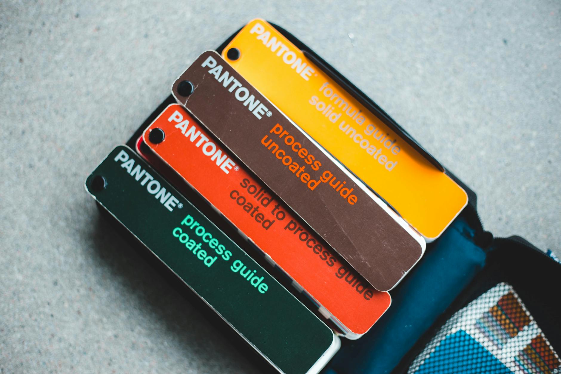
Photo by Erik Mclean
By focusing on standard file prep, solid communication with your print provider, and proactive monitoring of prints, you’ll soon see your designs hitting those perfect, eye-catching colors more often.
It’s all about setting the right foundation and keeping a close pulse on every print run.
Conclusion
Color management plays a key role in making sure your print on demand designs look just right when they come off the press. By understanding color spaces, calibrating your equipment, and working closely with your print provider, you can avoid surprises and deliver consistent, vibrant products your customers will love.
Apply soft and hard proofing, use the right color profiles, and keep refining your process to maintain quality and build trust with your audience. Taking these steps will reduce waste, save time, and help your business stand out with reliably accurate colors.
Ready to grow your print on demand venture? Check out this How to Start Print on Demand Business guide for next steps on scaling your POD success.


0 Comments